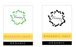
From the above designs I chose 3 designs which were the best and applied them to the chosen label designs, then printed them out. I chose the yellow colour because it is same / similar to that of the picallily. The mock ups that I have done have any contents in so once I have the label design I do need to test it out with the product in the jar.
This is the chosen design out of the above because the shape works with the shape of the jar and the strip and circle look much better in black. The contrast of serif and sans-serif typefaces work well toether. I think the logo could be moved down a couple of mm or made slightly bigger because at the moment the brand name isn't very visible on the main label.
I think the label on it's own works much better than having a label that surrounds the jar, also by having it on its own, you can see the home made, organic product whereas many of the non-organic products have a simple wrap around label.


No comments:
Post a Comment