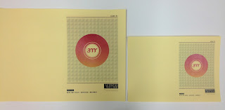
I printed the covers in both A4 and A5 format to see which one was better for reading and overall as a design and magazine.
I replaced the yellow design with yellow stock and the black and white design. The black ink didn't come out very well but overall I think that it is a good outcome and I will use two other colour stocks for the other issues. I would ideally like to have blue and pink, but I fear that the blue may be too dark. Ideally I would like to be able to screen print the covers as well as print them however I am running out of time to do this!
This was the first of stocks that I chose and I think that it is the best out of all the print outs because it has a creamy colour without being too intense and changing the colour of the gradient. I also think that it looks good in contrast the blue, black and grey of the design. It is a good gms, thick but not too thick, and the matte nature of the stock makes the cover more 'retro' and interesting to touch / pick up.
I think that this stock does also work; the slight orange tinge to the stock makes the design more interesting and the whole design stand out, however when it was printed out I think that the colour of the pink gradient has been slightly impacted as in reality (not in photos_ the pink is bordering on red and the orange is more pink. This would be my second choice of stock although I still want to test out a gloss finish
This stock was white card, much thicker than the other three stocks, giving the print a higher quality, however I didn't like this print out as much because I felt it was too white, and the print lost some of the character it gained with the cream and yellow stock. The quality of the print was much better on this stock but I don't think that this stock is appropriate for the type of publication that I am designing, it made the design seem more like a birthday card than a cover to a magazine.
These are all the A5 designed lined up against eachother. I still think that the coloured stock and monochrome print and the off white medium thickness (second print) are the best for the publication printout.
For the final design outcomes, I will be printing both A5 and A4. I originally just wanted to use the A5 designs, also because it would keep the print costs down; but after printing out the covers, I feel that the A5 is too small to look like a proper publication, the A4 printout has more of an impact and nicer to hold in your hands.


No comments:
Post a Comment