I am going to submit 4 publications, all have the same content but different front cover design, binding and colour specification, I wanted to see which of these would be most suited if the publication.
The pdf shows two publications that have been bound using saddle stitch, the colour and black and white versions.
I have added in a contents page at the front of the publication, and three adverts at the end of the publication; phone app advert, next issue advert and the blog page advert.
Alternate Music Room Finished Publications

Showing posts with label Publication. Show all posts
Showing posts with label Publication. Show all posts
Friday, 7 December 2012
AMR // Publication Binding
I have used two types of binding for the publications; perfect binding and saddle stitch binding.
Perfect Binding.
High end magazines and publications use perfect binding so I wanted to use this for one set of my publications.


The publication has come out well and all the pages are bound together. I was worried that it would make the publication harder to read but it didn't turn out to be an issue.


Saddle Stitch Binding
I originally intended just to staple the publication together, however when I did this I realised that because of the number of pages in the publication it was only possibly to staple the pages together, and even this was not very secure. So I successful stitched the pages to the publication.


Thursday, 29 November 2012
AMR // Publication Layout // Stage 2
I have gone through and edited all the points that were made in the feedback. I really helped to come back to the publication with a fresh eye as I started to see other areas that needed to be tweaked slightly that I hadn't noitced before.
I justified the colums as well throughout the article which has made a huge amount of difference. Some of the spreads have been kept the same, with minor changes, but others have changed drastically and are much better for it. Overall the article reads a lot smoother than it did before.


I have isolated the quote that before, was in between two columns of text, it reads much better and looks better.


I have swapped around the pages here and added in the logo of Audiojack's Label because when the article was printed out before I didn't feel there was enough on the page, especially considering it was the opening page to the article.

I have re-arranged the height, number and position of the columns so it is more readable, also I have removed the two lines at the two of the paragraphs that were slightly isolated.

I tried to keep this page as similar to the previous design as this was one of the pages I was happiest with.


I had a few problems trying to lay out the rest of the article, I had to swap the images around.


I have added in an extra column here to make it more readable, and shortened the height of them.


I have swapped the pages around, and isolated the quote so there is more text on the second of the pages, making the overall spread more balanced.
Overall I am very happy with the development of the publication. I have designed the contents page and just need to add in the advert for the app, the advert for the music blog and the ad for the next issue with an image of the chosen cover design.
AMR // Publication Feedback
I asked the feedback of a couple of piers who also took the type module last year and who are also producing a publication. The comments were good but areas / points to look at were...
Maya Jane Coles
- Widows
- Lines under the titles of the pages need to be thinner and all the same size throughout the article because they are too heavy in comparison to the weighting of the text at the moment.
Audiojack
- Single starting lines on their own at the top of paragraphs on the biography page
Bakermat
- On the last page swap the layout around so the text is on the left page rather than the right to increase readability.
- Biography page 1; add an extra column in from the other page because it doesn't read very well at the moment.
General
- Check the readability of the article, does it flow from page to page, make sure that there isn't too much white space where it doesn't need to be.
- Make the gaps between the text and bottom of images the same and smaller
- Try and make sure the top and bottom of the pages all line up
Wednesday, 28 November 2012
AMR // Printed Publication // Stage 1
From the layout that I finished earlier I have printed out a black and white a5 version, primarily because I know I will be reprinting it and editing it slightly so I wanted to save print costs.
I actually really like the black and white print out and I will include one of these in the final outcomes on the proper stock.
Some of the pages still need a bit of editing, I still need to add page numbers and a contents page but overall I am very pleased with how the publication looks.
There are 3 blank pages at the back of the publication that I had to include so it would make 32 pages, one of which I am going to advertise the music blog, the other the phone app...and the final one I am not quite sure yet!
Some areas of the design I need to revisit;
Audiojack - the first page, it is a little dull at the moment and needs more on it.
I need to change the images to CMYK from RGB.
Audiojack - the quote on the interview page needs to have smaller ledding and kerning.
Check the DPI of some of the images as they have come out pixilated - if need be then find a better image...
Printed Publication_Stage 1
These are two of the layouts which I like the most...and that I will refer back to when trying to improve the weaker pages of layout.


AMR // Publication Layout
I have completed the layout of the publication and taken screenshots of it.
There are still some details I need to add in; page numbers, contents page and I need to check over the image details and scale them down.
I am very pleased with how it is looking at the moment.
The front cover of this is not the one I will be using for the final design, I will be using the colour gradients and the black design on colour stock.


AMR // Layout Development
I have returned to the brief with the aim of being able to print it out and finish at leaste the first eiditon of it today. Below are screenshots of the developments. The layout I had before was very basic and I hadn't paid much attention to it, I was more concentrating on getting all of the information and the images on the page.
I have also added the last featured producer; Bakermat, a young producer from the Netherlands.
Layout Development


I have also added the last featured producer; Bakermat, a young producer from the Netherlands.
Layout Development


Tuesday, 27 November 2012
AMR // New layout ideas
I have gone back and increased the number of pages in the publication because I felt that I was trying to fit too much text on in a too smaller space and not making the most of playing around with an interesting design. These are just a few screenshots of the initial ideas for a new layout, I will go back and develop it further but it is a start.
AMR_New Layout Ideas
AMR_New Layout Ideas
Monday, 26 November 2012
AMR // Cover Designs // Printing & Stock
I printed out 3 of the cover designs in both colour and black & white to see which stock would be most appropriate. I wanted to use the black and white design as it is the staple colour of design, and thought that to make the print more exiting and stand out, using a bright coloured stock would work well.
I printed the covers in both A4 and A5 format to see which one was better for reading and overall as a design and magazine.


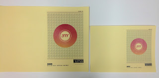


I printed the covers in both A4 and A5 format to see which one was better for reading and overall as a design and magazine.


I replaced the yellow design with yellow stock and the black and white design. The black ink didn't come out very well but overall I think that it is a good outcome and I will use two other colour stocks for the other issues. I would ideally like to have blue and pink, but I fear that the blue may be too dark. Ideally I would like to be able to screen print the covers as well as print them however I am running out of time to do this!


This was the first of stocks that I chose and I think that it is the best out of all the print outs because it has a creamy colour without being too intense and changing the colour of the gradient. I also think that it looks good in contrast the blue, black and grey of the design. It is a good gms, thick but not too thick, and the matte nature of the stock makes the cover more 'retro' and interesting to touch / pick up.


I think that this stock does also work; the slight orange tinge to the stock makes the design more interesting and the whole design stand out, however when it was printed out I think that the colour of the pink gradient has been slightly impacted as in reality (not in photos_ the pink is bordering on red and the orange is more pink. This would be my second choice of stock although I still want to test out a gloss finish


This stock was white card, much thicker than the other three stocks, giving the print a higher quality, however I didn't like this print out as much because I felt it was too white, and the print lost some of the character it gained with the cream and yellow stock. The quality of the print was much better on this stock but I don't think that this stock is appropriate for the type of publication that I am designing, it made the design seem more like a birthday card than a cover to a magazine.


These are all the A5 designed lined up against eachother. I still think that the coloured stock and monochrome print and the off white medium thickness (second print) are the best for the publication printout.


For the final design outcomes, I will be printing both A5 and A4. I originally just wanted to use the A5 designs, also because it would keep the print costs down; but after printing out the covers, I feel that the A5 is too small to look like a proper publication, the A4 printout has more of an impact and nicer to hold in your hands.
Subscribe to:
Posts (Atom)