Showing posts with label Labels. Show all posts

Friday, 30 November 2012

Curious Eats // Labels // Stage 3

I have moved around some of the text and added more information, a short statement about Curious Eats and information about the product. I have created the second label for the Chorizo using similar but more contrasting colours, but still in keeping with the Curious Eats colour scheme. 


I am a little worried about using Geosanslight for the typeface of the text on the black as it isn't showing up as much as I would like so I am going to change this to something with a heavier weighting. 


Thursday, 29 November 2012

Curious Eats // Label // Stage 2


Curious Eats // Salami Labels // Stage 1

First Design

I wanted to keep it simple and similar to the jar label designs. These were the initial designs to see how the elements needed to be fitted onto the design. 


The logo, type and colour strip are far too small and need to be repositioned but overall I think the colour works well with the rest of the design and the stock. 

Second Design

Simple adjustments and the length of the label needed to be extended to fit around the packaging. In the far right design I have used the red of the 'curious meats' logo. 


I am happy with how the labels fit onto the packaging. I have chosen the medium size white label which is a good size in proportion to the packaging. 

I can now see that the darker stock is definitely the stronger choice with the white label and the lighter stock is starting to look much cheaper, which isn't what I want. I want to try out a black stock and still print the logo pattern on the net, to give the feel of a UV spot varnish over the logo, then combine this will the white label. 

FEEDBACK

The label with the brighter red is better as there is more of a contrast

Try the net in a white stock and have the pattern of logos that is currently on the stock at the moment, on the label because salami is a 'greasy / dirty' product so you want the packaging as clean as possible. 

On reflection to the above comment...a white label may be problematic because of greasy finger prints after handling the food, so a brown stock would be better as it wont show up dirty finger print marks. 


Tuesday, 27 November 2012

Curious Eats // Fig & Cranberry Chutney // Stage 1


Fig & Cranberry - Stage 1


Curious Eats // Watermelon Pickel // Stage 2

I have changed the colour of the pink for the label and printed them out then chosen a lighter colour for the label.

The original colour


The new colour choice.


Watermelon - Stage 2

Curious Eats // Watermelon Pickel / Stage 1

I based the design of this label on the label that worked best for the Piccalilli jelly but changed the colour to be more representational of watermelon.


These two designs below were the chosen pair from the above collection that I printed out. I want to keep some form of similarity between all the jar'ed products so you can tell they are part of the same brand, so I have decided to keep them all in the same jar. I have added a gold line in which I propose to foil, I thought it made the products more sophisticated. 


Watermelon Pickel - Stage 1

I think the label works better without the extra line down the stem leading to the circle and I also think that it works better with the block colour at the bottom of the label. I like the addition of the gold strip however I don't think I will be able to foil it.

I also wakt to keep the typeface the same as the jelly and just change the colours of the labels. I have made the logo slightly bigger on the first design and it works much better.

I have thought about adding a very minimal illustration of the flavour of the content and having it very lightly incorporated into the background of the white, this will be a later development, because at the moment I think the simplicity is key and I dont want to over do it.

The pink / watermelon colour has printed out quite dark and almost looks like a strawberry colour so I will go back and edit this

Curious Eats // Piccalilli Jelly Label // Stage 1

I have started with the jelly, this is going to be for the jar with edges rather than circular.


From the above designs I chose 3 designs which were the best and applied them to the chosen label designs, then printed them out. I chose the yellow colour because it is same / similar to that of the picallily. The mock ups that I have done have any contents in so once I have the label design I do need to test it out with the product in the jar. 


Picalilly - Stage 1

This is the chosen design out of the above because the shape works with the shape of the jar and the strip and circle look much better in black. The contrast of serif and sans-serif typefaces work well toether. I think the logo could be moved down a couple of mm or made slightly bigger because at the moment the brand name isn't very visible on the main label.

I think the label on it's own works much better than having a label that surrounds the jar, also by having it on its own, you can see the home made, organic product whereas many of the non-organic products have a simple wrap around label.


Curious Eats // Labels Print Outs

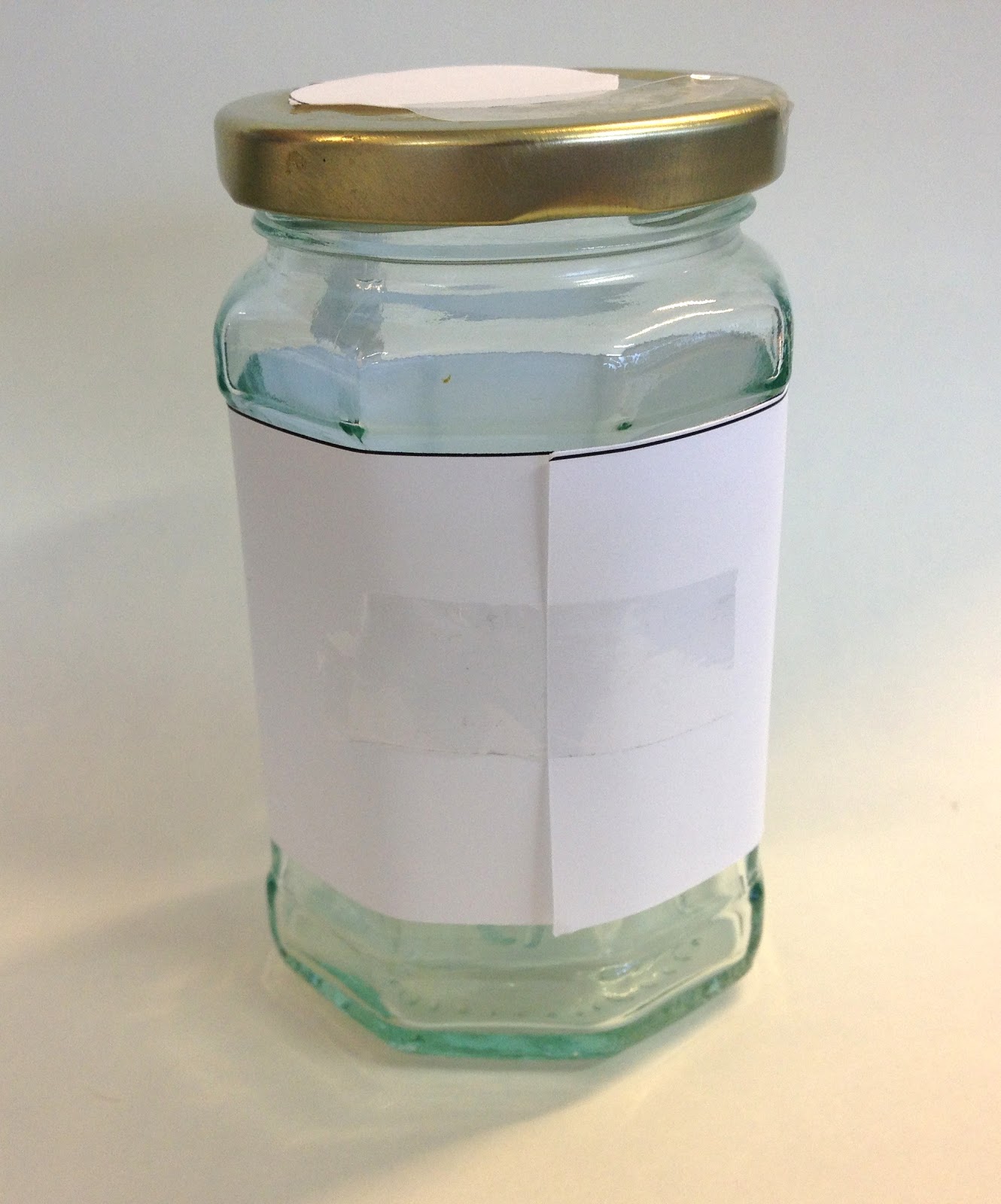
I have designed a range of labels but I never got round to printing out mock ups of the labels to see if they fit onto the jars before hand, I printed out 5 different design of label / shape and stuck them on the two shape jars I will be using.

I have taken pictures of the front and back so I can see how much the label overlaps on each of the jars, overall I am just looking at how well suited each label is for each of the jars, and how much a need to trim down each of them.

The truffle and salami packaging will be simple nets, no jars involved.

LABEL 1

This is just going to wrap around the whole jar. I will also make a simplified version of it which will be a sticker which will only contain the front part of the design.


It needs to be trimmed down by about 7mm

10mm of each end


It is a good size for the second jar shape. 

Each side needs to be trimmed at about 10mm

LABEL 2

This label I have decided not to use as the shape doensn't work with either of the labels. I have developed designs for this shape label but I will just apply them to other label shapes that I use instead. The label is far too big for the jar, but even if I made it fit I still don't really like how it fits with the rest of the jar. 


LABEL 3

This is another label which I am not going to use, and also one of the shapes that I started developing many label designs for. Again, it was far too big and the circular nature of the label where I was planninng on having the logo, really doesn't fit with the rest of the label shape. 


LABEL 4

I want to have the bit of the seal which you would tear off to open the label, but I need to work out how I can do this, weather I have the circle and stem as a sticker and then the rest of the label on a different stock. Another idea would be to take the wrap around nature of the label out and have the whole of the label printed on sticker stock, this would be more expensive, I could design one paper verson and on sticker verson. 

Overall it works well on the jars, alterations need to be made to ensure that it fits properly with each of the jars though. 


It height of it needs to be trimmed 10mm

The stem needs to be shortened about 2-3mm but the overal size of the circle is good

Needs to be trimmed 5mm each side


The height of the label is good but I think it can afford to be reduced by 4-5 mm in total so you can see the product more

The stem needs to be longer and the circle slightly bigger so it fits over the gold circle of the lid.