
I have changed the colour scheme to be much lighter and and much cooler than the previous scheme. I feel there was too much colour on the page and it didn't look very professional.
I have reduced the size of the icons in proportion to the toolbar, because I feel they were far too big and looked less professional, I looked on the apple website and there is a large amount of space around the button designs.

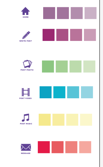
I took this colour scheme off the one that was produced in the PDF brief guidelines, and I have chosen to use the lightest shade of each of the colours so the viewer isn't bombarded with too many bright colours on the page. The simpler the better, especially as the user will be uploading photos, videos and other type of media which may clash with the colour scheme.

Using the New Colour Scheme
These are going to be used for the icons on the toolbar only, if I changed the background of the webpage there would be too much colour on the page and I want to keep the design simple and clean.


I think that having all the user / contact information in one toolbar looks much better, I have also used a rectangle with corners rather than curved corners which looks much smarter.


VIDEO BLOGGING

MESSAGES

No comments:
Post a Comment