Showing posts with label Logo Design. Show all posts

Friday, 7 December 2012

Glutton Club // Apron Logo

From the pictures I was sent of the Glutton Club and the designs, I have placed the logo on Georges apron and shirt


Thursday, 8 November 2012

Curious Eats // New Business Cards

Using the new brand design for Curious Eats, I have made a new range of business Cards.

I was deciding between these two designs but I chose the top design because I felt the bottom design was becoming too crowded.


Curious Eats // New Identity Business Cards

Wednesday, 7 November 2012

Curious Eats // Photographs of Printed out Designs

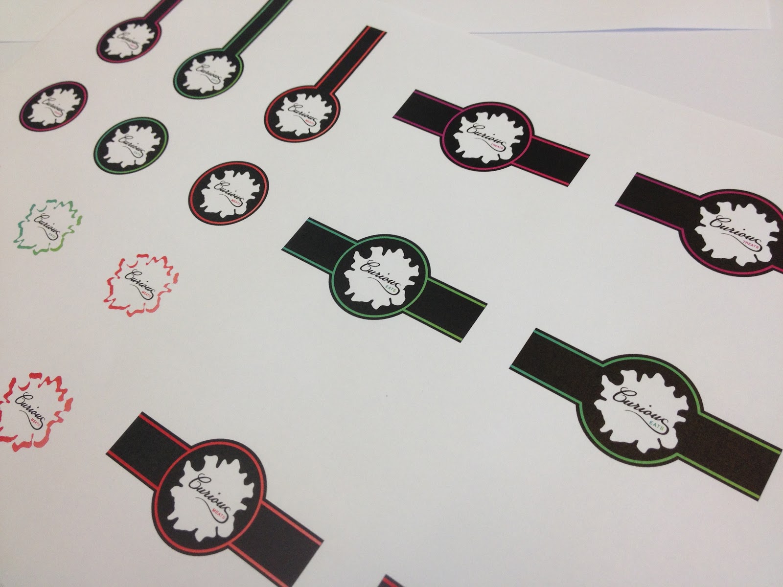
As expected but not anticipated the colours of the gradient have come out a bit darker than they are on screen. On print the there is a smaller difference between the two colours in each of the gradients and the green logo doesn't look as bright as it does on screen. I think I may need to go back and edit the 'meats' logo because when printed out there is little to no difference in the gradient. I also need to find the foils to match these. 

I have decided that these are the logos that are going to be turned into a pattern to put on the inner packaging for each of the product, an inner lining. I will also develop the jar top covers from these. 


I am happy with out it has come out. I am a little worried that the colour of the green is almost too bright for the brand, I think that it does look good but I'm worried it is starting to looks like a  more artificial green rather than natural, which is what the brand represents. The colours may be dulled down a bit when printed on a a different stock. 


I feel that the wrap around label needs more work, I propose to have the pink outline of the tag foiled so I need to test this out and have a look what the logo looks like on a white background. 


Curious Eats // Circular Label or Sticker

I developed a range of labels without a background, if these designs were to be printed professionally, instead of having the gradient foiled to the label, I would propose for it to be printed using the PAD process, directly onto the glass jar or packaging. I would also have to consider the colour of the product in the container because the design will be affected by this. I could be a possibility that all the type is white and just have the colour outline.

Curious Eats white label designs


In these designs I have kept the centre of the design white instead of transparent, this is to ensure that the logo is still legible. I would place the rest of the information below the design (flavour of chutney / jelly etc) but try to keep the main focus on the jar itself. Naturally you wouldn't be able to package meat in a jar like this, however I was just interested to see what the design looked like on a piece of packaging. 

Curious Eats // Label Tags

Here are the range of label tags that I felt were the strongest designs. I wanted to keep the design the same over the range, this way it can be applied to any form of packaging.


Curious Eats Jar Tags


I am pleased with how the labels are taking shape, I do think that the obscure edged shape I have used works very well, I just have to make sure that it will work accross another range of packaging, not jost for the chutneys.

The gradient on these labels I propose to have foiled in the various colours; pink / purble, red and green.

Curious Eats Label Packaging // Stage 3

I have developed the shape into a range of jar labels and tags, taking the formation which was the strongest from the previous development stage.


Packaging Label_Stage 3

Obscure shape development...

I asked for a bit of feedback on the range of logos on the jars and the logo that I had chosen was also picked. The edges of the logo are very irregular so I played around a bit with different versions of distortion of the logo to see if what it would look like.

The range of logos, I was using the roughen tool in the distort and transform section. I think that some of the logos are too 'rock' like and almost look like the outline of a crystal. Below are the two logos that I think work the best. 

This i the original logo, I still really like this logo because of the very strange irregular formation of the shape. 

This is the other logo that I thought worked well. It is a slightly less distorted edit of the circle and still retains some of the normality to the shape (you can tell what it was before and isn't totally outlandish). I think that I am still swayed to use the top logo because it is more interesting, weird and fits the brand better. I will try out both of these shapes just to check that the shape is appropriate. 

Logo on the Jars

In photoshop I have placed the new selection of logos in the various shapes on a selections of slightly different shaped jars to see which one is best.


Curious Eats_Jars and Logos

I seem to be stuck on this logo below, it was a complete mistake when making it and I definitely didn't intend it to come out like this however I do feel that this is the strongest out of all the shapes because of its obscurity and uniqueness. It is a good representation of the brand and also could be applied to a strange food shape or spatter! It is modern but still interesting. As well as this, the shape could then be recognised as being connected only to Curious Eats, because of its unique shape...this is exactly what i was trying to achieve.  My only worry would be that all stickers and labels would have to be dye cut which would increate print prices. There may be a a way around this which would be to place the shape on a white circular background and when printing the stickers, the logo could be printed on a transparent circle.


Tuesday, 6 November 2012

Curious Eats and its Curious shape

I am trying to design the logo for the packaging, I needed to take the design in a new direction and come up with a shape that is unique to the curious / irrecgular / intersting and sometimes slightly odd nature of the curious eats food so I have been testing out various edits of a circle using illustrator distortion effects.

I have placed a few of the better designs on their own page. I tested out with putting an outline around the logo and trying to represent its unique nature by creating a shape that would be unique to the logo itself. I will print them out and see how they look on print as it is difficult to tell on screen. I want to keep the sophistication in the brand but also want to show that they are a different brand, I cant use a shape that is too irregular otherwise the brand will lose its quality and start looking more abstract and controversial.

Curious Eats - Curious Shape Logo design

Monday, 5 November 2012

Curious Eats // Final Chosen Logo Colour Scheme

This is the chosen colour scheme for the logos.


Logo Further Development Chosen Colour


Photos of the logos printed out on normal 80gsm paper

Printed Out Logos


I am pleased with how the logos look printed out. I do think that the brown set of logos look the best, so this is what I am going to stick with for the rest of the brand. I think that the black writing is too harsh. I also am pleased with how the logo looks in white on a black background.

I have just noticed that I have not changed the bottom logo to 'treats' and on the printed out photograph it still reads 'eats', I have gone back and corrected this.

Curious Eats // Logo Colour Development

I have gone back and edited the logo so that the C fits more with the rest of the type and I do feel that it now looks much better.

I also went back and looked at other designs and on Kuler to update the colour scheme that I chose for each of the 3 logos because the feedback was that they weren't very bright and wouldn't catch people attention, despite being appropriate for brand and to represent the organic / locally sourced nature of the products.

Here are the developments. The chosen logo colour scheme are in the bottom right corner of each board.

I have decided to go with a gradient for the small words because I felt it gave the logo a more sophisticated look and feel, and also because I couldn't decide between the pink and purple for the 'treats' logo so I decided to combine them...which actually worked out much better!


Logo Further Developments Stage 1

Wednesday, 31 October 2012

Music Logo // Compound Mask

I needed to be able to turn the logo into a compound mast to put over photos and throughout the publication


Glutton Club // Logo Design

I had to take the old design of the logo and update it, make it more sophisticated. I had been asked just to change the typeface but I started playing around with the whole design of it as I felt that the fish illustration was not doing much justice to the appearance and character of the rest of the logo.


Logo Stage 1


This was the new logo that I came up with. The second image below was where I was trying to play around with the weighting of the fish so that it wouldn't take the focus of the logo. I used a typeface I got off dafont called Optimus Principus. 


Alternative Music Room // Final Logo

Here are the range of final logo designs, I am very happy with how they have turned out. I still need to work on a design to be a clipping mask and a monochrome edition of the logo that can be printed / screen printed onto the stock. Logo Final

Tuesday, 30 October 2012

Logo Design // Stage 6 // Colour and Type

Having chosen the logo I now needed to chose the typeface for the text below the logo.


Stage 6_Logo and Type


I started off thinking that I was going to use this typeface for the main design of the logo however when I came back to the designs, I didn't think that it fitter very well. Although the typeface is 'alternative' from the normal sans-serif typefaces used for music pages, I felt that it gave the logo too much of a vintage feel and I couldn't see it being used throughout the publication and on other designs. 

After creating the app logo, from a distance I didn't think the broke two white outer circles looked good so I tried just using a whole circle white outline and I felt it gave the logo more of a finished feel. 


This is the chosen logo for the Alternative Music Room


New Logo // Iphone App

I was just playing around with what the logo looked like and downloaded the music blog page as an app after updating the new logo and here are the photos of what it looks like.


Here are screenshots of what the logo looks like on the blog (top left corner where the https link is).


Music Logo Colour Choice

I slightly changed the intensity of the colours within each of the logos the printed them out again to see which ones looked better.


These are the colour gradients that I have gone with, I changed the blue / green one so that the free was at the top of the gradient rathe than the bottom because it looked better print out this way. Logo Stage 5 Colour Choice

Logo Design // Stage 3

I have taken the designs that I like and developed them. I removed most of the outer lines and re-arranged them and I am now happy with the final result. The next stage of the design is to apply colour.


Logo Stage 3

The type under the logo design still needs work but this is will be the overall layout

Logo Stage 2 // Print out


I circled the designs that I thought were best and made developments from  them. I still think that having the logo simple is better so in the next stage of designs I will remove some of the vinyl lines and see how they look. 

Alternate Music Room // Stage 2

I had the idea over the weekend of adding the 'arm' logo to a vinyl to help represent the music element. On many of the youtube links that are on the blog, the image displayed when the song is being played is just the design of the vinyl for the EP, here are the quick designs that I have done.


Logo Stage 2

These are the 4 that I think are the best, I can't quite decide which one I like best so I will print them out and see. Gerneally I feel that the more simple the logo the better, especially when Ill be applying it to the publications and other photography, I don't want it to be the main focus.