Wednesday 12 December 2012


Tuesday 11 December 2012
Brief 1 // Curious Eats // Submission Boards
Curious Eats // Submission Boards
I feel this was my strongest brief from OUGD301. I am very pleased with the design outcomes and the concept I came up with for the 'curious' shape for the logo. This brief too much longer than I originally thought, the branding in particular. It took just over a week to create the main logo (typefaces) but it wasn't until a few weeks later that I came up with the irregular circle encasing the logo. I think the colour scheme works well across the range and the gradient gives the logos more depth. I feel this brief was the most successful because it of my interest in packaging of food and drink products. I would have liked to do some promotional material for this brief, however the branding and design for packaging too much longer than expected, which is fine because I feel the packaging range is a strong design outcome.
I feel this was my strongest brief from OUGD301. I am very pleased with the design outcomes and the concept I came up with for the 'curious' shape for the logo. This brief too much longer than I originally thought, the branding in particular. It took just over a week to create the main logo (typefaces) but it wasn't until a few weeks later that I came up with the irregular circle encasing the logo. I think the colour scheme works well across the range and the gradient gives the logos more depth. I feel this brief was the most successful because it of my interest in packaging of food and drink products. I would have liked to do some promotional material for this brief, however the branding and design for packaging too much longer than expected, which is fine because I feel the packaging range is a strong design outcome.
Brief 2 // Alternative Music Room // Submission Boards
Alternative Music Room Submission Boards
I am pleasantly surprised at how this brief turned out. I chose this brief was I wanted to develop my publication skills. The publication itself turned out to be much longer and more content based that I originally intended. I slightly understood the amount of time it would take me to generate all the content. I had a few problems with gathering some of the content, due to a select of artists that I wanted to include in the publication, did not have enough information written about them so I had to source other artists. I am pleased with how the logo has turned out and happy with the colour scheme I have used. I had a few problems in the early stages of it's development as I couldn't design any ideas for the logo that I was happy about. Eventually after a tutorial a made a decision on which of the logos I was going to use to develop further and I am happy with how it has turned out, there have been many stages of it's development over the course of the 6 of the 8 weeks the brief took. I am happy with the overall design of the publication, I think the typeface choice and layout fits well with the type of music the blog publishes. I would have liked to design more for a range of promotional material, raising the awareness of the blog however the branding and publication too longer than I gave myself time for.
I am pleasantly surprised at how this brief turned out. I chose this brief was I wanted to develop my publication skills. The publication itself turned out to be much longer and more content based that I originally intended. I slightly understood the amount of time it would take me to generate all the content. I had a few problems with gathering some of the content, due to a select of artists that I wanted to include in the publication, did not have enough information written about them so I had to source other artists. I am pleased with how the logo has turned out and happy with the colour scheme I have used. I had a few problems in the early stages of it's development as I couldn't design any ideas for the logo that I was happy about. Eventually after a tutorial a made a decision on which of the logos I was going to use to develop further and I am happy with how it has turned out, there have been many stages of it's development over the course of the 6 of the 8 weeks the brief took. I am happy with the overall design of the publication, I think the typeface choice and layout fits well with the type of music the blog publishes. I would have liked to design more for a range of promotional material, raising the awareness of the blog however the branding and publication too longer than I gave myself time for.
Brief 3 // The Glutton Club // Submission Boards
Glutton Club Submission Boards
This brief started off being a small brief, a fifth brief but over the course of the module I seemed to be engaging with this brief rather than trying to develop my fourth brief. I feel this is because it was a live brief and so it was incredibly exiting seeing my designs evolve, especially seeing the logo placed on the board above the restaurant. I am very happy with the concept and the design of the logo, I feel it works well across cross all media and reflects the of the restaurant well. When the client first approached me I had a clear idea of the type of design the logo would be, and I am very happy with how it has turned out.
This brief started off being a small brief, a fifth brief but over the course of the module I seemed to be engaging with this brief rather than trying to develop my fourth brief. I feel this is because it was a live brief and so it was incredibly exiting seeing my designs evolve, especially seeing the logo placed on the board above the restaurant. I am very happy with the concept and the design of the logo, I feel it works well across cross all media and reflects the of the restaurant well. When the client first approached me I had a clear idea of the type of design the logo would be, and I am very happy with how it has turned out.
Brief 4 // Submission Boards
Yahoo // Submission Boards
This is the brief that I struggled with the most, it was slightly out of my comfort zone and I don't feel I connected with the content or design outcomes as much as originally thought I would. I am glad that I persevered with it instead of trying to find a competition brief that was more suited to my interest, because in the industry I will not always be given briefs that I have an interest with, so this was a good learning curve, applying my design strategy to an unknown subject. I feel my time management on this brief was poor in comparison to my other briefs, this is because I spent too long choosing a concept to follow. Overall I am happy with the concept I chose, I think it was strong, but in future I will make sure that I connect with a brief properly so to avoid this problem again. It did allow me to develop skills for phone app and web design, something that I said I wanted to develop from the start of this module, but I feel that if my time management had been better, I would design outcomes would have been stronger.
This is the brief that I struggled with the most, it was slightly out of my comfort zone and I don't feel I connected with the content or design outcomes as much as originally thought I would. I am glad that I persevered with it instead of trying to find a competition brief that was more suited to my interest, because in the industry I will not always be given briefs that I have an interest with, so this was a good learning curve, applying my design strategy to an unknown subject. I feel my time management on this brief was poor in comparison to my other briefs, this is because I spent too long choosing a concept to follow. Overall I am happy with the concept I chose, I think it was strong, but in future I will make sure that I connect with a brief properly so to avoid this problem again. It did allow me to develop skills for phone app and web design, something that I said I wanted to develop from the start of this module, but I feel that if my time management had been better, I would design outcomes would have been stronger.
Yahoo // Range Development
Yahoo // Range Development
I have developed the logo / strap-line more so that it is in line with 'blog' as before I feel there was too much type, I have also changed 'have your say' to Gotham Book typeface instead of Gotham Bold, which I think makes a better contrasts and means the focus is more on 'Yah' rather than the strap-line.
I wanted the background colour for the app to be the Yahoo spot colour, and by using a gradient it creates more depth, I also found that a large majority of app designs also use gradients in the background. By adding the Y-bang logo at a very low transparency, it increases the depth in the background, also makes the app easily identifiable.
Created a couple of different format online advertisements, I took the templates off the yahoo website, I wanted to keep the design simple because the Yahoo page is already incredibly cluttered, and by having large sections of bold contrasting colour it makes the adverts stand out, especially since purple and yellow are complimentary colours.
Monday 10 December 2012


Yahoo // Final Blog Designs

I am happy with how the blog design has turned out, I think that the white and light purple colour scheme is much stronger than the deep purple spot colour scheme, I felt that that design was much too intense and looked more childish and less stylish.
Yahoo // Design // Stage 3
I have changed the colour scheme to be much lighter and and much cooler than the previous scheme. I feel there was too much colour on the page and it didn't look very professional.
I have reduced the size of the icons in proportion to the toolbar, because I feel they were far too big and looked less professional, I looked on the apple website and there is a large amount of space around the button designs.

I took this colour scheme off the one that was produced in the PDF brief guidelines, and I have chosen to use the lightest shade of each of the colours so the viewer isn't bombarded with too many bright colours on the page. The simpler the better, especially as the user will be uploading photos, videos and other type of media which may clash with the colour scheme.
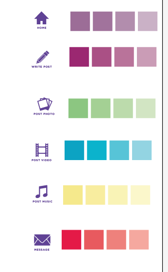

Using the New Colour Scheme
These are going to be used for the icons on the toolbar only, if I changed the background of the webpage there would be too much colour on the page and I want to keep the design simple and clean.


I think that having all the user / contact information in one toolbar looks much better, I have also used a rectangle with corners rather than curved corners which looks much smarter.


VIDEO BLOGGING

MESSAGES

Sunday 9 December 2012
Yahoo // Blog Design // Stage 2
Homepage

Blog Posting Page

Photo Posting
Taking the element of Interest and Facebook combined, users can post photos that interest them and also upload photos of what they are doing.

VIDEO POSTING
Users can post videos they have found, and upload ones they have taken themselves such as turoials or video blogging.

MUSIC POSTING

EMAIL / MESSAGES


Yahoo // Page Design // Stage 1
I am going to keep the design of the blog very basic in terms of colours, and keep to the purple theme for the homepage so it is easy to identify as Yahoo. It will also mean that the format will be easily transferrable across all electronic items; desktop, phone and table.
The concept of this brief is to make Yahoo! more personal, at the moment I feel the target audience can't connect and interact with the website much, not in comparison to Facebook, Twitter, Pinterest etc. By being able to create their own site / page, they have a reason to use the website for news, answers and have their daily feeds.


The concept of this brief is to make Yahoo! more personal, at the moment I feel the target audience can't connect and interact with the website much, not in comparison to Facebook, Twitter, Pinterest etc. By being able to create their own site / page, they have a reason to use the website for news, answers and have their daily feeds.


Subscribe to:
Posts (Atom)